Phoenix is a design system for the Formstack platform—an evolving set of reusable components, rules, and guidelines that give Product Designers and Engineers a toolset for consistent design and development and result in consistent user experiences for users of the Formstack platform.
Problem
In 2015, Formstack didn’t have a consistent ruleset for UI components, colors, iconography, written copy, or implementation. The Forms application had inconsistently implemented styles and had an undefined visual language. Multiple Product Designers were struggling to ensure their work was consistent. Development wasn’t as speedy as we knew it could be if we were all working from the same system of components and patterns.
History
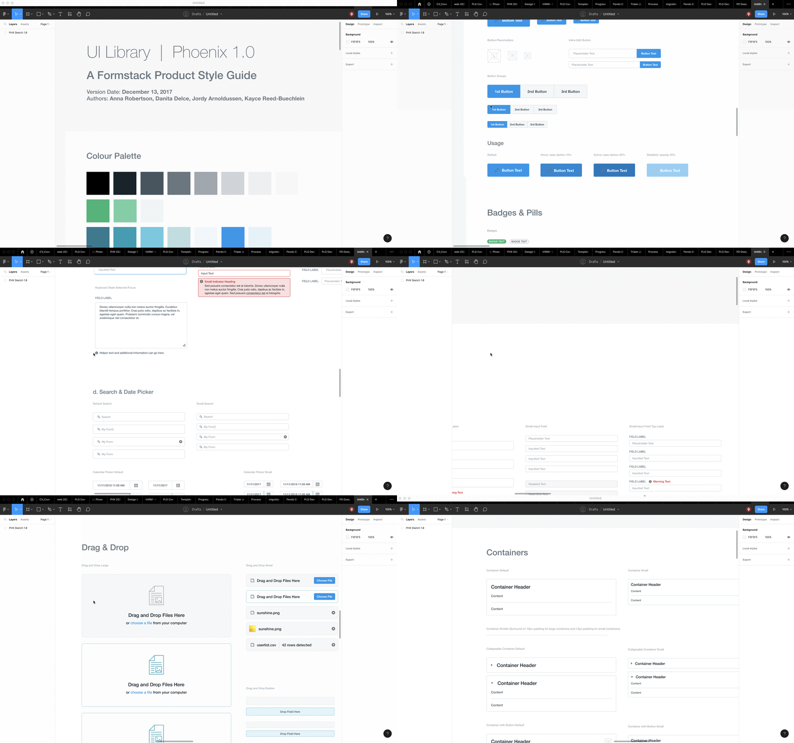
Early discussions were ripe with subjective banter about colors, spacing, and tossing gradients in the trash (flat design had established its dominance). Our first iteration, UIL, short for UI Library (we were very original, we know 😊), was a large Photoshop file where each component had its own layer group, each variant a layer to drag into your design file. No version history, no publishing changes or cascading styles, no toggling variant properties, no auto-layout—how far we’ve come.
The next version coincided with our team’s move to Sketch, which we were reluctant to move towards based on the number of projects we had in the queue built out in Photoshop. However, Sketch’s introduction of component libraries convinced us. We needed to adapt.
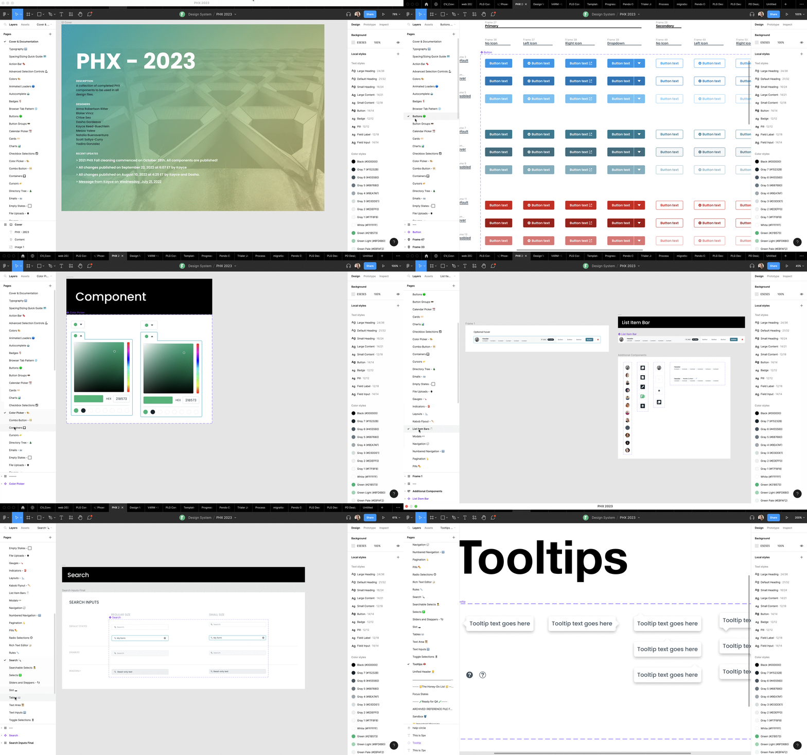
The latest and current version is a sophisticated collection of components, patterns, page layouts, style guides, and documentation on how it all works that empowers designers and engineers to use the same language and building blocks; all built within Figma.
Objectives
To address the challenges faced by Formstack in terms of inconsistent UI components and a lack of a well-defined visual language, the Phoenix Design System was developed with the following in mind:
- Streamline design-to-engineering handoff and collaboration:
- Objective: Create a design system that facilitates a seamless handoff process, minimizing surprises and discrepancies during implementation.
- Approach: Foster close collaboration between Product Designers and front-end Engineers, ensuring a shared understanding and consistent implementation of the system’s components and patterns. Regular feedback loops and cross-functional workshops were held to gather input and align on improvements.
- Establish consistency across the entirety of the platform:
- Objective: Ensure all designers implement UI components consistently throughout the platform, even as the Product Design Team grows.
- Approach: Develop a robust system of reusable components, guidelines, and rules within Sketch libraries, later transitioning to Figma in 2020. This iterative implementation approach allowed for continuous improvements, ensuring a cohesive visual language and consistent user experience for customers.
By combining these objectives with a collaborative approach, the Phoenix Design System successfully achieved streamlined design-to-engineering handoff, minimized discrepancies, and established consistency across the Formstack platform. The close collaboration between Product Designers and front-end Engineers, along with the iterative implementation process, led to significant adoption of the design system and paved the way for future enhancements and code coverage expansion.
Status
As of Q2 2023, Phoenix achieved significant adoption across Formstack applications, with approximately 80% code coverage powering the front-end. Looking ahead, the team has goals to achieve 100% code coverage across all Formstack applications and reaching full parity between the product design system in Figma and the Front-end Engineering team’s storybook (React JS).
Team
- Aaron White, VP of Product Operations
- Kayce Reed-Buechlein, Director of Product Design
- Blaise Vincz, Product Design Manager
- Anna Robertson, Senior Product Designer
- Dasha Gordeeva, Senior Product Designer
- Scott Soltys-Curry, Senior Product Designer
- Chloe Seo, Product Designer
- Yadira Gonzalez, Product Designer
- Meaza Yalew, Product Designer
- Jake Brokaw, Product Designer
- Jason Walkow, Product Designer
- Arianne Quiñanola, Product Designer
- Jordy Arnoldussen, Product Designer
- Many additional colleagues from Front-End Engineering, Product Management, Product Marketing, and Content were also vital contributors to the success of PHX.
* Titles above at time of primary contribution to initiative